
Making of the company and logo

Initial Exploration

|
|
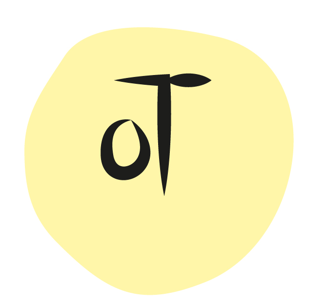
I was very confused about my logo, I was playing with the shapes of T, O and a leaf. I was working on oT initially which means bubble tea (O represents bubbles and T represents Tea).
AWSM


I started working on AWSM which are basically four seasons in all four letters. The logo has been designed with the help of ‘Handlee regular font’. I played a lot with font in terms of sizes and colours. I expanded the four letters, changed the shape a lot and started placing it in different ways. I wanted it to be in a circle and have only one colour. Where ever the logo is put, the letters take the colour of the background.
Bottle tops

